Haystack Consulting

Approach
This wasn’t a clean-slate exercise. Haystack had built a reputation on curiosity and creativity. What they needed was a brand that matched the way they work today: data-driven, sharp, and full of human touch. We made a visual identity with the right balance of edge and eccentricity. One that gives people an experience they didn’t expect.
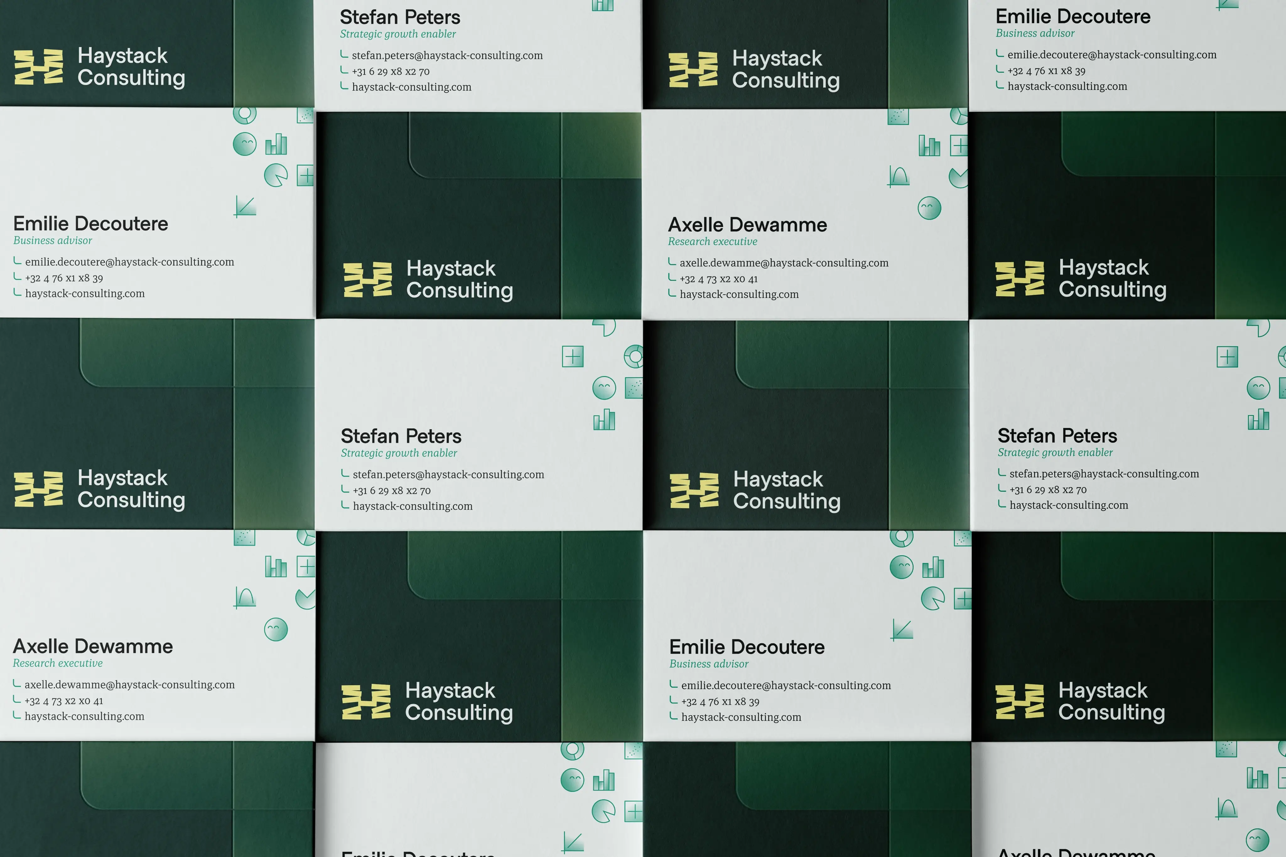
At the core of the identity sits a distinctive, modular H logo, built from individual blocks that represent different data insights forming an informed bigger picture when put together. In motion, those blocks stack into place, just like the name. The system is flexible andfull of small quirks. Just like how the launch video came with classic orchestral drama, some would say that's not an obvious choice.


The outcome
Internally, the rebrand sparked real excitement, it gave the team not just a new identity, but a renewed sense of where they’re headed. They where always clear on their ideas and strategy, we supported that through visuals. It’s a brand that’s finally in sync with who they are: sharp, playful, and always thinking a few steps ahead.

“The brand identity feels very authentic to all I have experienced when working with Haystack. Well done!”


